Thunderbolts and lightning, very very enlightening
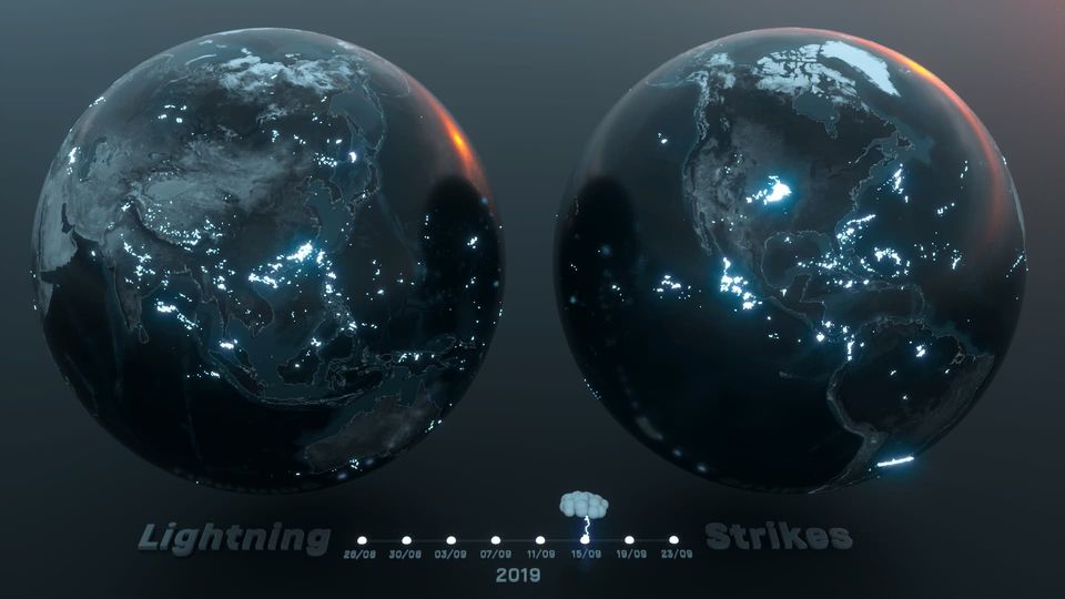
Craig Taylor and I recently collaborated on a series of spatial visualisations using global lightning strike location data. This is what we came up with!
This is a repost of an article I wrote on the Spatial Awareness blog last year.
A few weeks ago Craig Taylor and I sat down and agreed on a challenge. The idea was simple — we would both take the same dataset and then each go off and use our spare time to create a spatial visualisation using the tools and methods we’re most comfortable with. We’d then come back and share our visualisations with each other and the rest of the world, and hopefully learn something new from the whole experience.
It sounds like a great idea. But what dataset should we visualise? 🤔
We wanted to go with something different. Something that was a challenge for us creatively, but also something interesting and new for the people who end up viewing these visualisations. It turns out there aren’t many datasets that fit that bill, but after a bit of research and negotiation we settled on global lightning strike location data. It’s a dataset that I’d been curious to explore for some time, and it’s also one that you don’t see many visualisations on, especially outside of academia.
The rest of this post will go into some detail on the data, as well as how we both approached the challenge and the techniques behind our visualisations.
OK, enough teasing — here are the results of our spare-time tinkering over the past few weeks. I recommend viewing them in full screen!
Craig and I are both very active on Twitter, so make sure to follow us if you want to see more like this, or if you have any questions about our visualisations. [
Craig Taylor (@CraigTaylorViz)
Data Visualisation Design Manager @Itoworld


Robin Hawkes (@robhawkes)
Obsessed with maps and data. Spatial Awareness newsletter. Creator of @ViziCities. Prev. Senior Principal Engineer @WoodMackenzie and worldwide devrel @Mozilla.

I also recently interviewed Craig about his approach to spatial visualisation, which you can read here:
Lightning strike location data
It’s all well and good wanting to create a visualisation from lightning strike location data, but how do you get access to it when there’s no free and public source?
The short answer is, you don’t. The long answer is, by reaching out to the people who collect this data and crossing your fingers that they’ll let you access it and make something fun with it. I’ve always been of a mindset that if you don’t ask, you don’t get — and this was no exception.
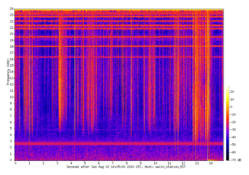
After some research and asking around on Twitter, I settled on the World Wide Lightning Location Network (WWLLN). The dataset is the result of a collaboration of over 50 universities and institutions around the world, who together run a global network of sensors. After reaching out to them we were given permission to access their 2019 dataset and create something fun with it.
But how is the data collected in the first place? Good question, and this aspect of the dataset was just as fascinating to me as the visual output.
The global network of sensors monitor very low frequency (VLF) radio frequencies in the range 3–30 kHz. When a lightning strike occurs, much of the energy is radiated in the VLF and so can be picked up by these sensors — these signals are referred to as “sferics.” To grossly oversimply; when enough of these sensors pick up the same signal, a rough location can be inferred using the difference in time it took to reach each sensor.
Something else that’s worth pointing out is that not every single lightning strike is detected by the network — particularly ones that never leave the cloud. In fact quite a low percentage of global strikes are recorded, however the data is still significant and allows for all sorts of analysis and visualisation.
It’s a deep and interesting subject. If you’d like to learn more then there are various papers on WWLLN and how it works. And if there’s interest, perhaps I can follow up with another post going into more detail — let me know on Twitter or in the comments below.
Some words from Craig
It has been a blast collaborating with Robin on one of my favourite side projects this year! Having a mutual love for animated spatial data visualisation, yet a slightly different skill set in terms of approach and toolset, meant that we could both utilise the same dataset yet come up with different concepts and an ultimately unique view into how our tools of choice best represented the data.
Having spent the past few months living inside of Houdini and producing a number of global animations on Earthquakes and Meteor Landings recently, I had a bit of a template in terms of visual approach.
The challenge for me was how to animate the lightning strikes over a period of time in a coherent way. Fortunately I have recently developed a workflow in Houdini to take in a CSV file with a date stamp and utilise this metric to animate a geometry’s scale (spheres). There is an ‘easing’ in of the spheres meaning that they grow from small to large and eventually shrink again after a certain amount of time — enough time to show the propagation of a storm.
The end result is a global view of lightning strikes over a 4 week period with the two globes showing each side of the earth for maximum exposure of strikes.
Offcut experiments
The visualisation started very differently as you can see from the offcut video. I loved the idea of showing an abstract view of the strikes (however inaccurate this may be!) with a sphere growing in height from its start time to the strike appearing at its apex height and then disappearing gradually.
The result was certainly interesting in terms of being able to comprehend the propagation of a storm but ultimately I wanted a more global view of the data. The end offcut in the small show reel is perhaps the stupidest thing I have done, trying to turn the strikes into clouds which ended up looking like odd marshmallows!
The benefits of collaborating
Robin and I spent a lot of time talking about approaches. It’s been great sharing concepts, iterations and failed ideas with each other and also pretty fascinating to see how others work.
It’s been pretty valuable to me on a personal level, not only because it’s nice to share workflows etc but also because I learnt a lot about how I approach visualisations.
For a lot of my side-projects (not client projects!) I often fall into the trap of producing a flashy animation with minimal insight, I like to experiment with visualisation styles but often don’t spend enough time creating insight. This is where I think Robin’s visualisation blows mine out of the water, as well as being beautiful it’s an interesting concept and one I have often thought about in terms of air travel and storms. It’s eye opening the extent to which planes attempt to divert from storms (thankfully!) and when animated is actually quite playful — almost like a game of cat and mouse!
My take away from this collaboration is to not just rely on visual fidelity but to create more of a narrative for side-projects, delivering insight and stories alongside beautiful visualisations makes for a much more compelling experience!
Data sources
Tools
- Houdini and OctaneRender
Some words from Robin
When I first pulled a subset of the strike data and threw it into QGIS I quickly realised that I had absolutely no idea what to do with it. Sure, it looked cool, but what could I do with it that was interesting? What stories does it contain?
After a few false starts I had an idea to see if there was a correlation between recorded lightning strikes and air traffic in the same area. My hypothesis was that if lightning strikes occur near an airport, then perhaps air traffic will be forced to divert around it. If I could animate that then maybe you’d be able to see those diversions happening over time.
Fortunately I’d already created a bespoke system for processing and visualising animated air traffic data in WebGL. From that base I was able to relatively quickly modify aspects of that system to visualise the lightning strike data as well.
To work out which airport to visualise I threw all the lightning data into PostGIS and ran some basic aggregations around major airports. I grouped lightning strikes by day and ordered them from days with the most strikes, to those with the least. I then clipped the top 10 days for each airport and this gave me a good indication of which airports to focus on.
Putting things into perspective, Heathrow airport in the UK had just over 600 strikes on its most “striking” day over a relatively large area nearby. In comparison, Dallas Fort Worth in Texas had well over 47,000 strikes in a single day in a similar-sized area. And with that, Dallas Fort Worth became the airport to focus on.
It was such a great feeling when I first ran the combined visualisation and moved back and forth through the timeline. What became immediately obvious was that my hunch was right — the air traffic was actively moving to avoid the storms, and you could clearly see it in the visualisation.
As this is a side project in my spare time, I haven’t been able to do everything that I’d planned, and there are all sorts of things that I’d do differently next time. I do plan to visit this again though — there are just too many avenues to explore and unanswered questions.
I’m also considering writing a more in-depth overview of how I processed the data and pulled together the visualisation. I can’t share the data, but perhaps the extra detail on the process will still be of interest. I’d also like to go into more detail about how and why aircraft move the way they do when avoiding storms.
Let me know on Twitter or the comments below if you’d be interested in that.
The benefits of collaborating
Working on this with Craig has been a great experience and I’m hoping we get to do it again. It’s been awesome seeing his approach and how it progressed from a rough idea to an incredibly polished visualisation. Like seriously, it’s bloody amazing what he can produce in a fraction of the time I can.
In fact, at one point I was so blown away by how slick his visualisations were that I got hugely demoralised and went back to the drawing board with my own. I’d argue that working this way with Craig made me think more critically about my own work and push myself to think differently and consider details that I may have otherwise glossed over.
Overall it’s been hugely valuable for me to see how differently we approached this. Craig’s creativity and laser-sharp focus on beautiful visualisation has helped me learn a lot about how to improve my own work in those areas. And in general, it’s just been really nice to bounce ideas and talk about things.